 01245 929 994

The best logo should reflect the brand and represent the company in the best light. It must have colours and fonts that fit the brand as well. But how do you choose the right colour and font?
Two things:
1. Colour conveys or inspires emotion.
2. Font draws or turns the eyes, and creates the mood.
For these reasons, you need to know which emotion you wish to inspire from your target market, and then decide which font would work best with your logo’s design.
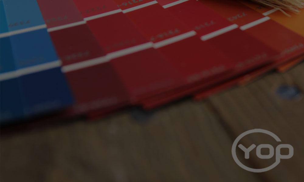
Know what emotions go with what colour
Blue: Peace, Integrity, Intelligence, Calm, Authority, Strength, Professionalism
Green: Youth, Health, Money, Relaxation, Nature/Environment, Optimism, Growth, Luck
Yellow: Energy, Appetite, Warning/Caution, Happiness, Friendliness, Warmth
Pink: Cuteness, Energetic, Softness/Femininity, Romance/Flirty, Vibrant, Tenderness
Black: Elegance, Authority, Power, Mystery, Strength, Value, Sophistication
Orange: Health/Vitality, Autumn, Determination, Force, Vibrancy, Youthfulness
White: All Business, Pure, Clear, Simple
Red: Passion, Adventure, Love, Appetite, Desire, Action, Violence, Power, Stop
Purple: Royalty, Luxury, Ambition, Creative, Wealth, Mystery, Femininity, Spirituality
Based on the information above, you can then choose a shade or colour palette that best describes your brand, company or the values you want to uphold. So start by listing down words that best describe your brand. Need more help in identifying which colours to use? Brainstorm words that fit your company message or describe what your brand is all about. Is it professional, passionate and luxurious? You can then combine the shades that match those words.
For example we would describe ourselves with:
- Elegant,Value – Black
- Clear – White
- Vibrant – Pink
- Growth – Green
Keep in mind the rules for colour combination
Choose colours that aren’t too bright and are close to each other. The last thing you want is for the shades to overshadow other aspects of the logo design, or create a stark contrast that visual harmony is lost.
Whatever colour you choose, make sure your logo or banner would still look awesome in greyscale, colour, black or white.
Know how some of the common fonts are defined.
Script: High-End, Romantic, Feminine
• Best for: High-End Boutiques, Expensive, Cologne, Winery, Weddings
Thins Sans Serif: Modern, Elite, High-Fashion
• Best for: Studio Photographer, Makeup Brand
Bold Sans Serif: Masculine, Modern, Casual
• Best for: Design Agency, Modern Letterpress Shop, Accessory Boutique
Serif fonts: Classic, Fashionable, High-End
• Best for: Leather Goods Designer, Fashion Magazine
Typewriter style: Organic, Vintage, Old
• Best for: Scrapbooks, Writer, Vintage Collectors
Bold Condensed: Masculine, Bold, Casual
• Best for: Modern men’s clothing, Brands with a laidback reputation
Handwriting: Carefree, Personal, Casual
• Best for: Event Planner, Lifestyle Blogger, Etsy Shop
Remember the rules on font selection
In choosing a font, select one that your audience can easily associate with your brand, product or service. A font that has been around for a long time, such as Serif and Bold Condensed, is less likely to go out of style as well.
Avoid fonts that are cluttered, heavy, boring or off, and go for something that is legible and readable. Don’t mix fonts, but you can always choose a secondary font that complements the one used in the logo. Don’t be afraid to customise your own fonts, provided that you don’t lose sight of what matters – how your target audience will associate it with your brand and company.