 01245 929 994

A logo plays an important role in creating a brand for a company. It visually represents the business and the colours used provide important information about the company. It conveys the core identity of the business to the audience. That said, it is essential that the design of the logo is well-thought of, from the font size to the choice of colours. This is where basic colour theory comes into play.
Colour selection need not be a cornucopia of hues but something that will help your target market identify with your brand. Say, the business is about cloud computing. Colours to be considered should be near the shade of blue. They should give a good vibe and encourage an emotional response.
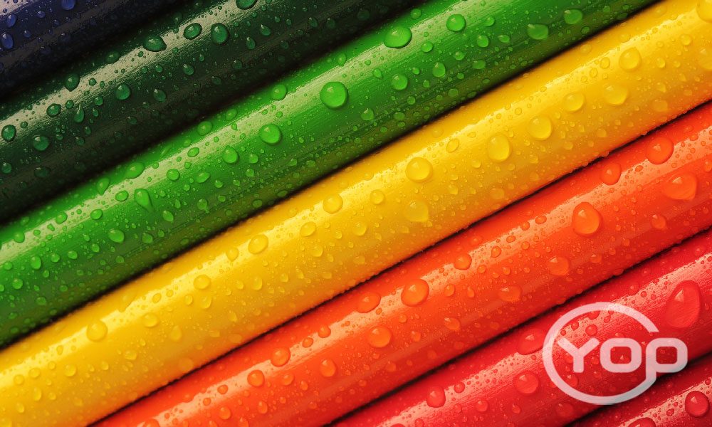
Colour theory is part of visual arts and is a guide to mixing colors and creating the desired visual effects from the combination of colours. It is also part of the curriculum of students of Fine Arts and Interior Design. Over the years, there have been books and online articles about color theory but one element that is essential is the color wheel. This is a wheel subdivided in parts with the core being the primary colours, followed by the secondary and tertiary colours. The primary colours are red, yellow and blue while the secondary colours are the results of combining two primary colours, such as green, orange and violet. Conversely, tertiary colours result for the combination of adjacent primary and secondary colours with the results depending on the percentage of primary colours used for mixing.
In designing logos, how the combination of colours play together is critical to coming up with the appropriate logo for the business. This has something to do with what are known as complementary and split-complementary colours. Complementary colours result to mixing two colors located opposite each other on the colour wheel while split-complementary colours are colours that result from mixing located exactly beside another color’s complementary. Then there are also analogous and triadic colours with the former being colours located next or near each other while the latter are colours are simply three colours located at the end of a triangle.
On Designing Logos
Selecting the right colours for logos is crucial since what may seem suitable on the colour wheel may be different visually when applied to logos. It’s imperative to take into consideration legibility that can be affected by choosing multiple colours with the same hues or selecting colours because they are the personal preference of the business owner. For example, yellow is a vibrant colour and is attractive. Numerous people like this colour but for a logo, this primary colour is too bright and will not be a good logo colour unless it is bordered with black or white with black going well in all colours. Moreover, if you will incorporate complementary colours in the logo design, ensure that you will apply neutral colour as an outline or barrier.
Logo designing entails a lot of trial and error but if you know basic colour theory, it will be easier for you to make the right colour choices.
Back to blog